

Aston Villa celebrate iconic mosaic again in new 2026/27 third kit from adidas
Villa's newest shirt from adidas pays tribute to the Holte End and reinstates full-colour club badge
Aston Villa and adidas have unveiled the club’s new third kit for the 2026/27 season.
Villa and their technical partner have gone back to the Holte End well after adopting the mosaic motifs on the sleeves of last season’s home shirt, picking out a tonal mosaic pattern in white and baby blue.
A simple claret round collar matches the sleeve cuffs and the new embiggened adidas stripes on the shoulder, which are interrupted by the Betano sponsor logo on one arm and the various competition marks on the other.
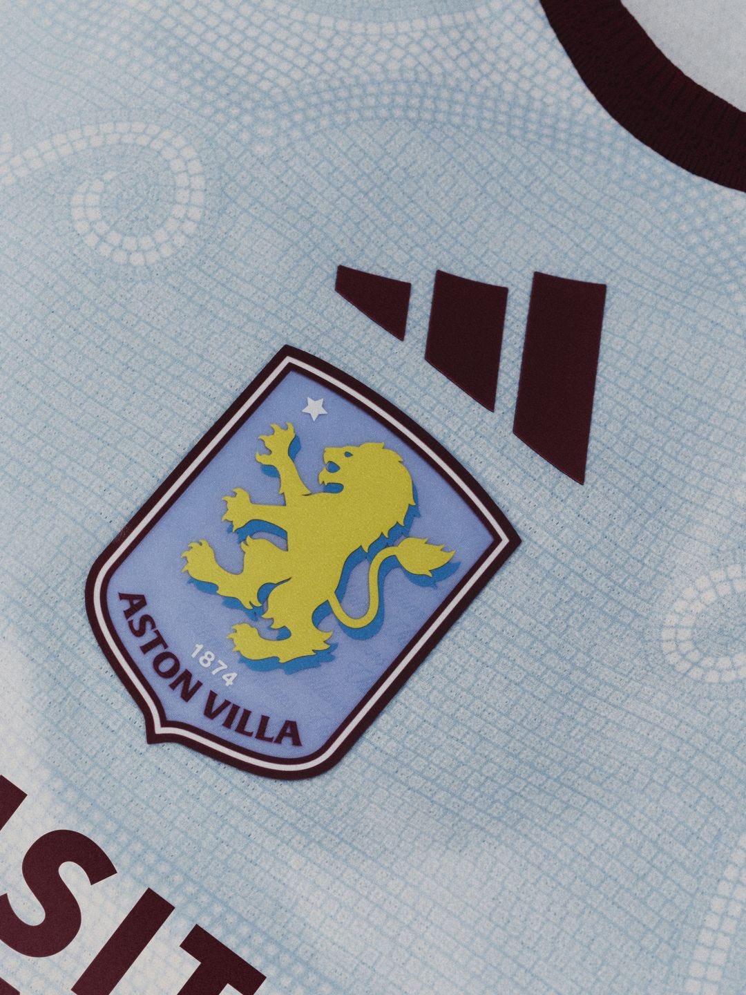
The colour pairing is familiar enough and it’s the decorative mosaic curls that make the shirt a bit different.
Third shirts are the perfect canvas for messing about and trying stuff out, and I’m a big fan of the general look and the detail of the body, but the shirt overall is a case of nearly but not quite; great ideas almost executed flawlessly.
Upgrade now for wraparound match coverage and other features for just £4 per month.
Mosaic aside, the most striking aspect of the shirt is the alignment of the three logos on the front.
The adidas mark, Villa badge and Visit Rwanda branding are centred and stacked, a design choice I don’t mind on occasion but which is let down by the same thing that lets down all Villa shirts, shorts, and everything else these days.
The Villa crest is a mess
Whisper it, but the reason this shirt doesn’t quite cut it for me is that the club badge has been afforded pride of place. That’s how it should be, of course, but it only works if the badge works and the Villa badge doesn’t.
There are ways to get around that. It looks better in near-monochrome form on the 2026/27 home shirt, for one, though I accept the view that an adapted badge should be avoided on the home kit more often than not.
But if the badge is to be centred and framed, given hero status, using the full-colour version with yellow lion splodge and drop shadow is a good way to expose it for the calamity it is.
That’s without accounting for the decision to use it on a shirt that means it’ll be one blue on another, which isn’t doing a great deal for me either.
Anyway, I think it’s a good shirt and a nice idea. I hope it will be popular. But the badge needs to be dealt with, I’m afraid.
Photos? Photos.
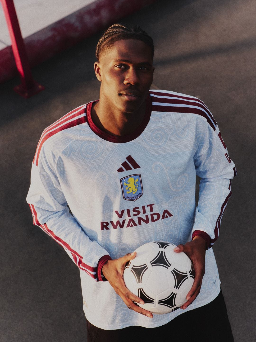
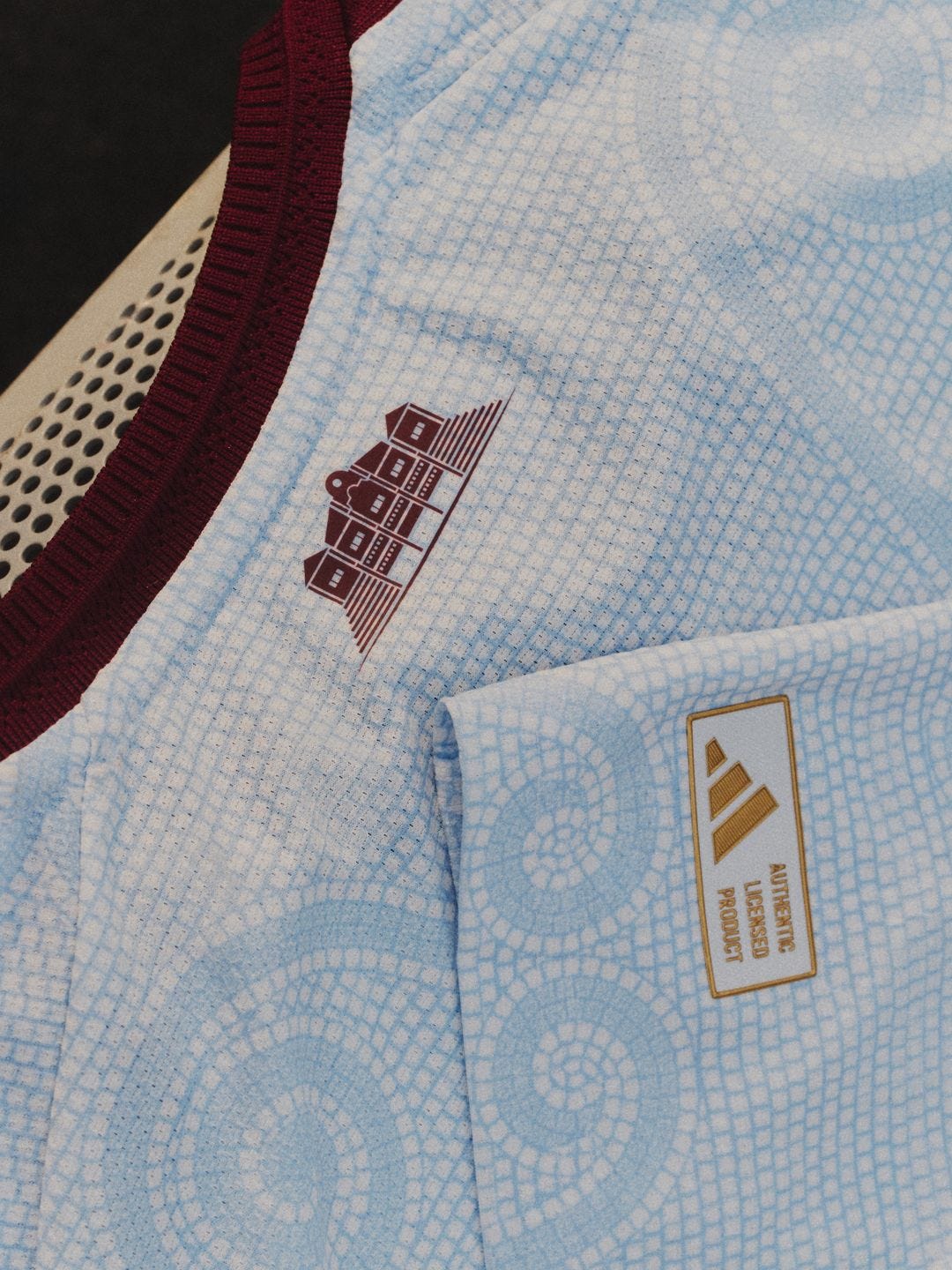
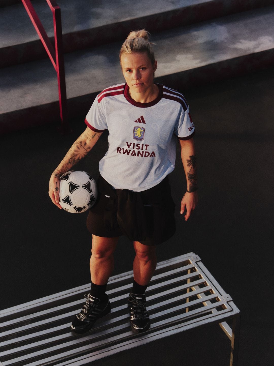
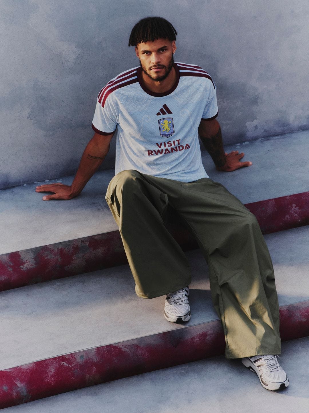
Villa’s new third shirt is now available at Villa Park, at the Bullring store, and online.
I like the Holte End silhouette on the back but that badge…that bloody badge. A drop shadow, ffs
It looks like a pyjama top to me. I’ve never liked a central badge sitting atop a sponsor, and it hadn’t occurred to me until you mentioned it but the colour version of the badge makes it even more jarring here.